The power of language is so incredibly strong that it can unite or divide with a single word. The photograph above wasn't shot in Washington DC last week, but in Turkey nearly five years ago, along with the one below in Lebanon the same year. And interestingly, the feeling these words evoke in me now is very different than when I photographed them back in 2012.
I was on my way to Syria with my accomodation booked in Damascus. The war had only just begun and my host assured me that the part of the old city where Sah al Naum was located was still pretty safe. Given the political climate at the time, Ahmed was desperate to have guests and as I'd learnt much of the country's history, especially about its artwork and ancient ruins, I was excited to be going there. Sadly though, because I was unable to locate the embassy and obtain a visa, I never got to cross the border. Today, just putting the two words "Syria" and "Airbnb" together seems so incongruous.
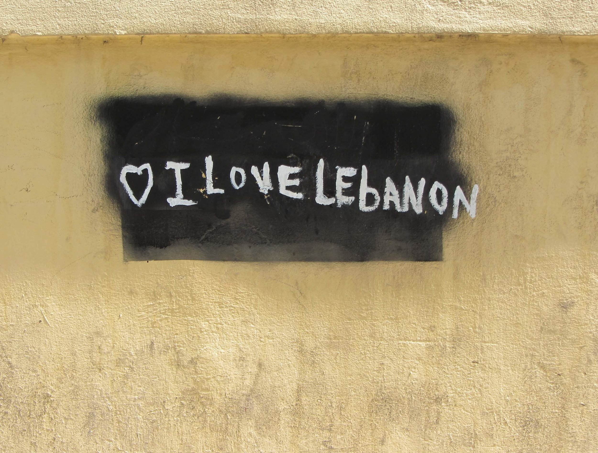
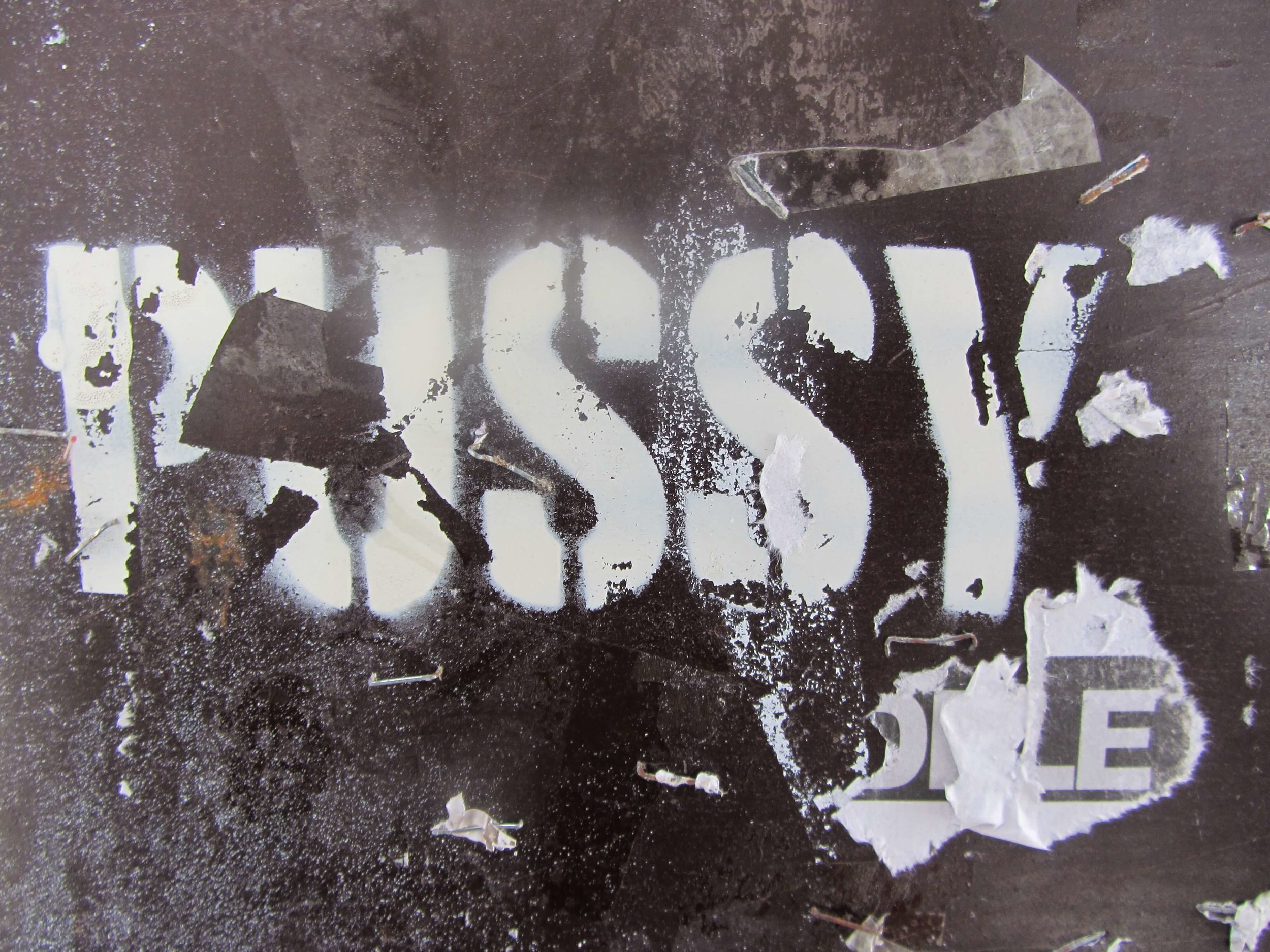
Grafitti - Beirut 2012
As I'm writing this, the photographs evoke an overwhelming feeling of sadness, in much the same way as I felt when I made an artwork years ago that represented refugees drowning off Australian shores. The exhibition piece was titled 'Sea of Tears' - a tiny boat full of scrolls containing the names of those who died. Feathers hanging on nylon filament reflected a father's grief when he told how the children were like dead birds floating on the water.
Sometimes during the process of creating a new artwork, naming it happens serendipitously with a phrase springing to mind; a title that expresses exactly what I want my work to say. Other times, I draw on text or an image that's been included in the piece, whether it's humorous, a little dark or carries a sad or subtle message. But occasionally nothing fits and I need to look elsewhere for inspiration. Titles for me are important as they convey a deeper understanding of the artist's intent. I always feel a sense of disappointment when a work is untitled, though I understand some artists do this intentionally.

Annulus - Ken Unsworth 2007
Titles artists give their work can be intriguing: works like Ken Unsworth's Annulus (see above). Although open to personal interpretation, Annulus refers to the ringed shape of the work featuring river stones and a web of crossed wires, and with or without knowing what the word means, the sculpture speaks of balance and harmony.
Over the years I've taken numerous photographs of signs and graffiti and added these to my files. My love of words also sees me jotting down phrases that seem to sing, including those in other languages. Is it the words themselves, or the way they sound that is so beautiful?

Grafitti - Istanbul 2012
One of my favourite ways to name my work - if a title hasn't come to me already - is to incorporate existing text gleaned from vintage books and documents. Their beautifully aged papers often have quaint words and phrases that seem to suit my style of work. I came across an old crossword book recently with amusing titles for each of the puzzles and I've used one of these in my latest assemblage.
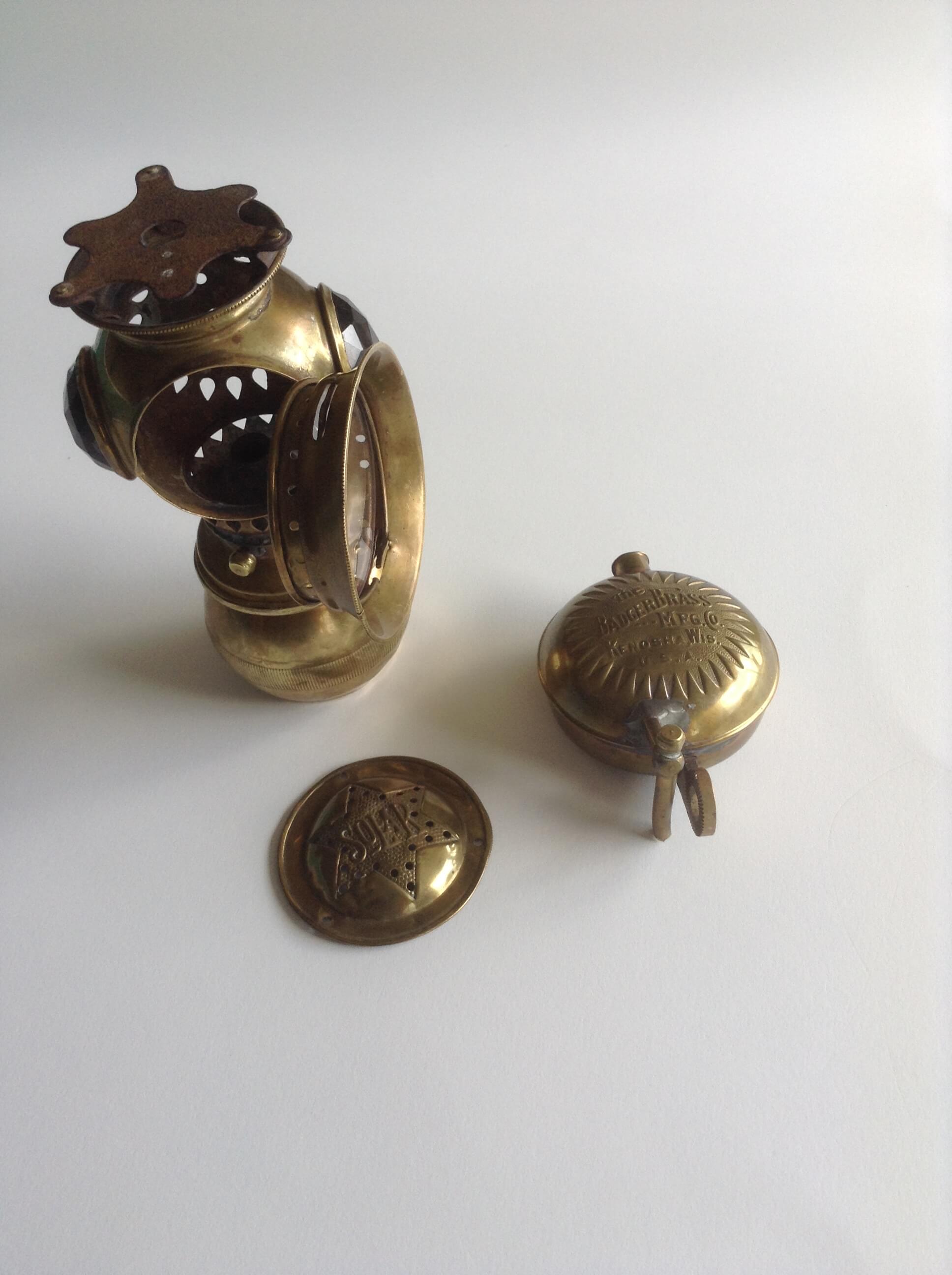
Original acetylene lamp
This piece began life as a vintage brass acetylene lamp purchased from a deceased estate. It had the makings of something special and I took the lamp apart with the intention of incorporating as many surprises for viewers as possible. Firstly, the burner inside was removed to make way for an object that could be peered into behind the glass door.
I set a clock spring into a bed of epoxy with a faint image of a woman underneath, and a bird's claw and coloured stone on top. Fitting this in neatly was tricky, requiring some fine brass to be wrapped around the edge of the object so it could slip firmly into place. Text was then fixed around the rim behind the glass door.
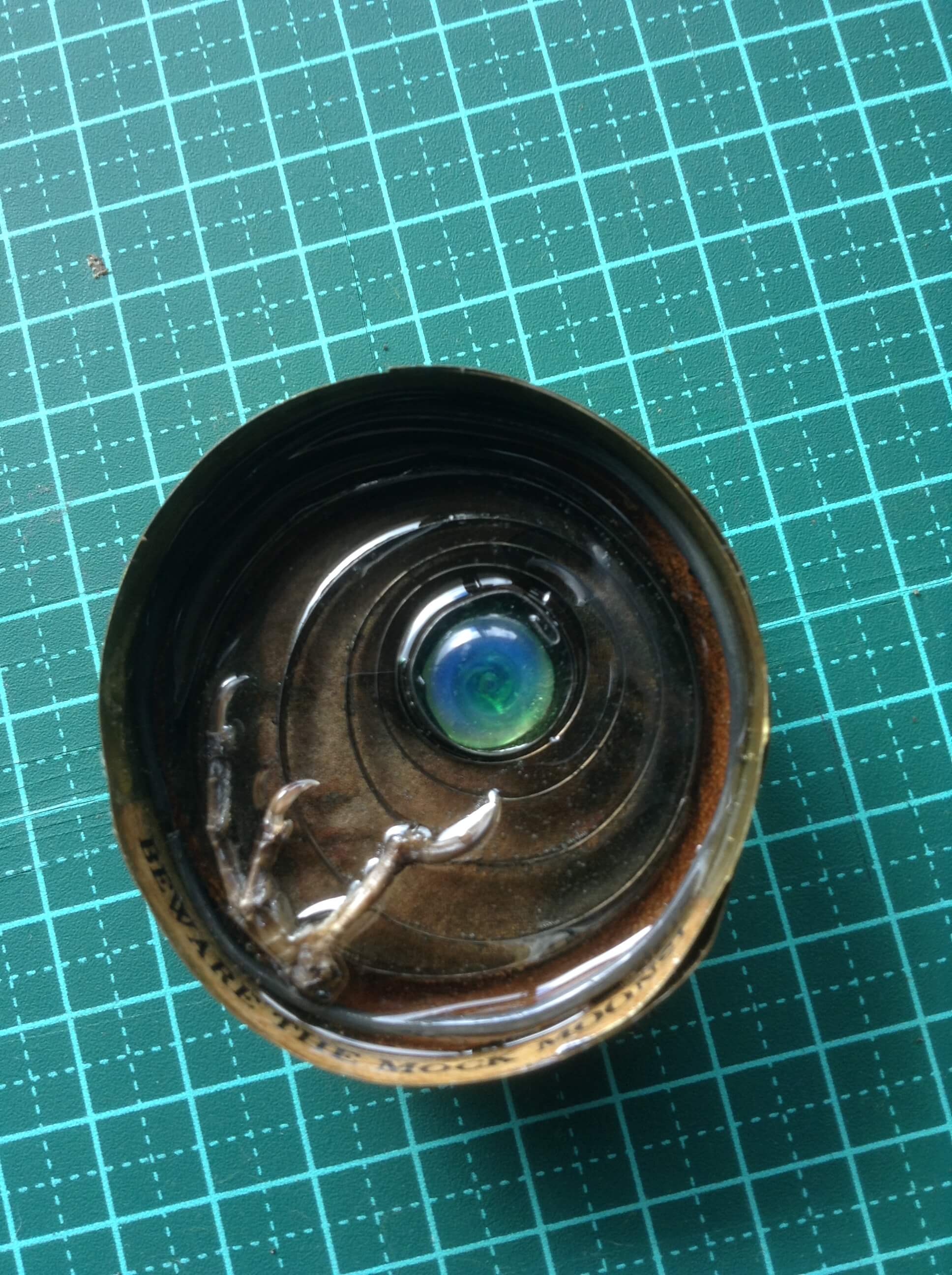
The mock moon
The brass bowl beneath the lamp could be unscrewed, providing a cavity for a brass pocket watch case I've long treasured. Inside, I set a tiny bird skull into epoxy along with glass eyes, text and beach sand. Trying to screw the bowl back onto the lamp proved difficult, but with the aid of my trusty Dremel, the inside surface was cleaned up enabling the thread to work easily.
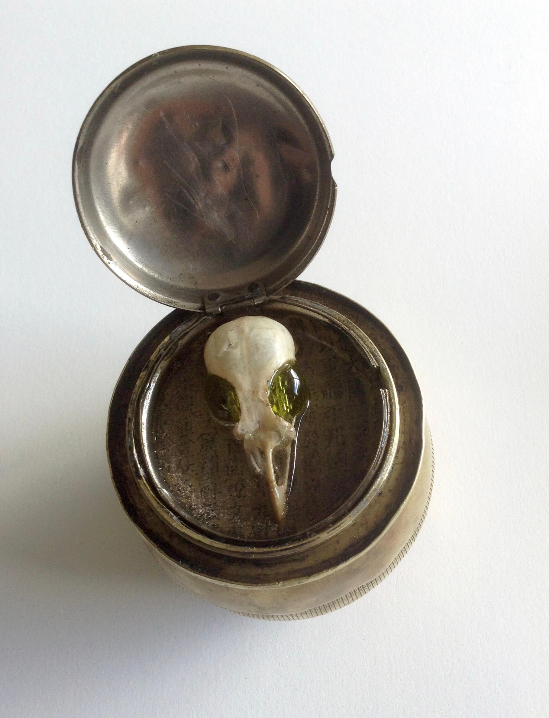
Pocket watch case
Rather than screw the original lid back onto the lamp, hinges were soldered in place so a bezel could be dropped in behind the clock spring. The bezel comprises of a carapace with a small crab and beach findings epoxied inside its shell. Although the shell was solid, I had a problem when the first application of epoxy leaked out of the carapace - a timely lesson in checking first how water-tight something is!
A length of corroded copper tube was flattened and curved into shape for the bezel. The next step was to drill through the shell to set pins into it in order that the carapace swivelled. When the diamond drill began smoking I thought all my work had been wasted, but with a little more persistence the required depth was achieved. A chain attached to the lamp completed the bezel.
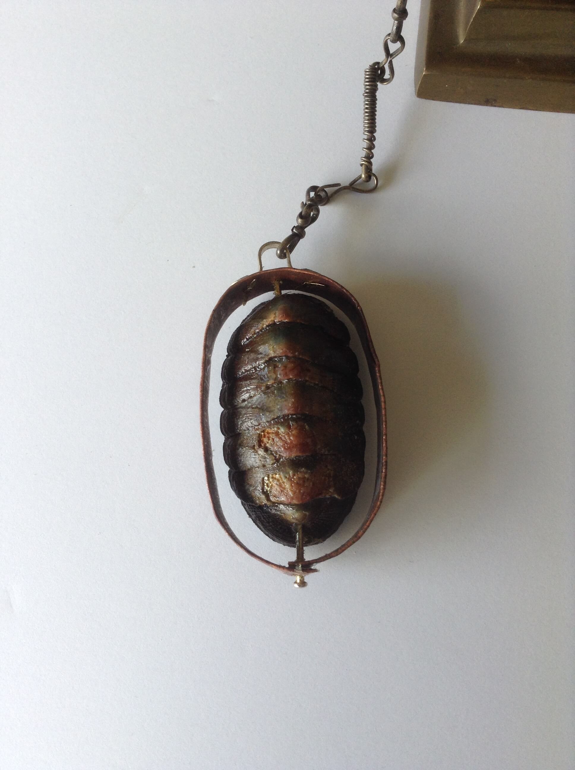
Bezel carapace
I wanted the window in the lamp to be viewed at eye level and nothing I had seemed ideal for the job. But a brass candle stick that had originally been intended for another piece, fitted the bill perfectly. Once everything was screwed, soldered and glued together, including a small door knob for the rear, I sat the assemblage on my workbench for a few days to get a feel for whether it was truly finished. Something seemed to be missing.
A rummage in my parts collection uncovered a toy trumpet which only needed a small adjustment to make it fit. Although mounted to one side of the body, the trumpet improved the balance of the work, adding more visual interest and lending itself to the idea of howling at the moon.
'Beware the Mock Moons' is finally completed. Perhaps it's one of the pieces that I'll be tempted to keep in my collection.....we'll see.
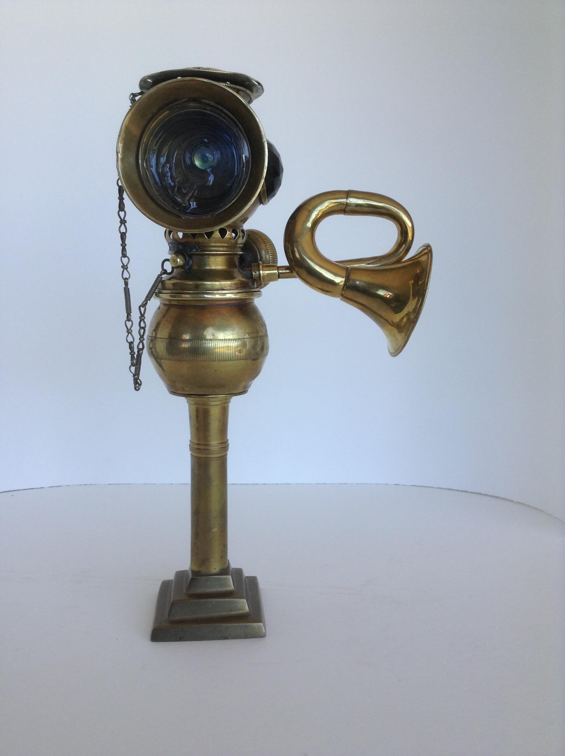
Beware the Mock Moons